THE STORY
EXPANSIVE. EXTENSIVE. EXTRAORDINARY.
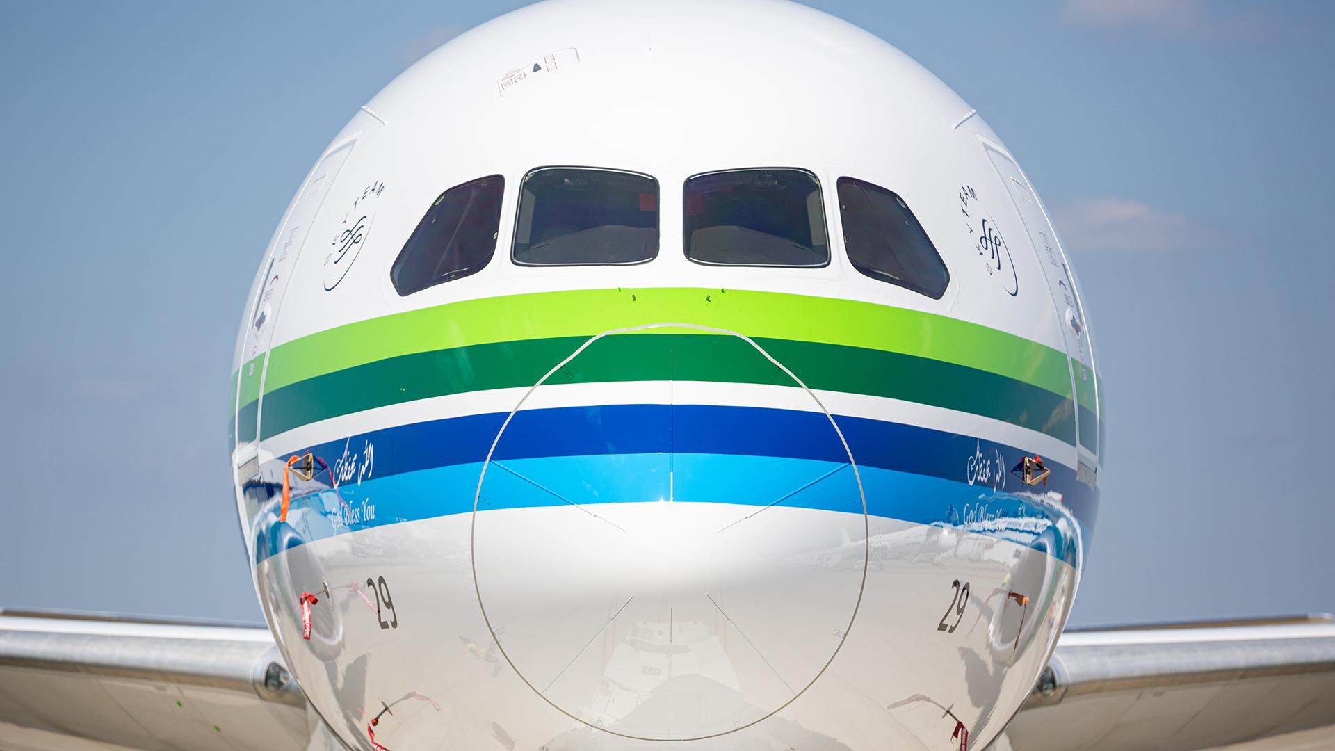
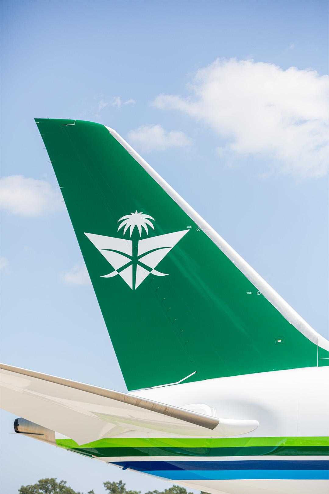
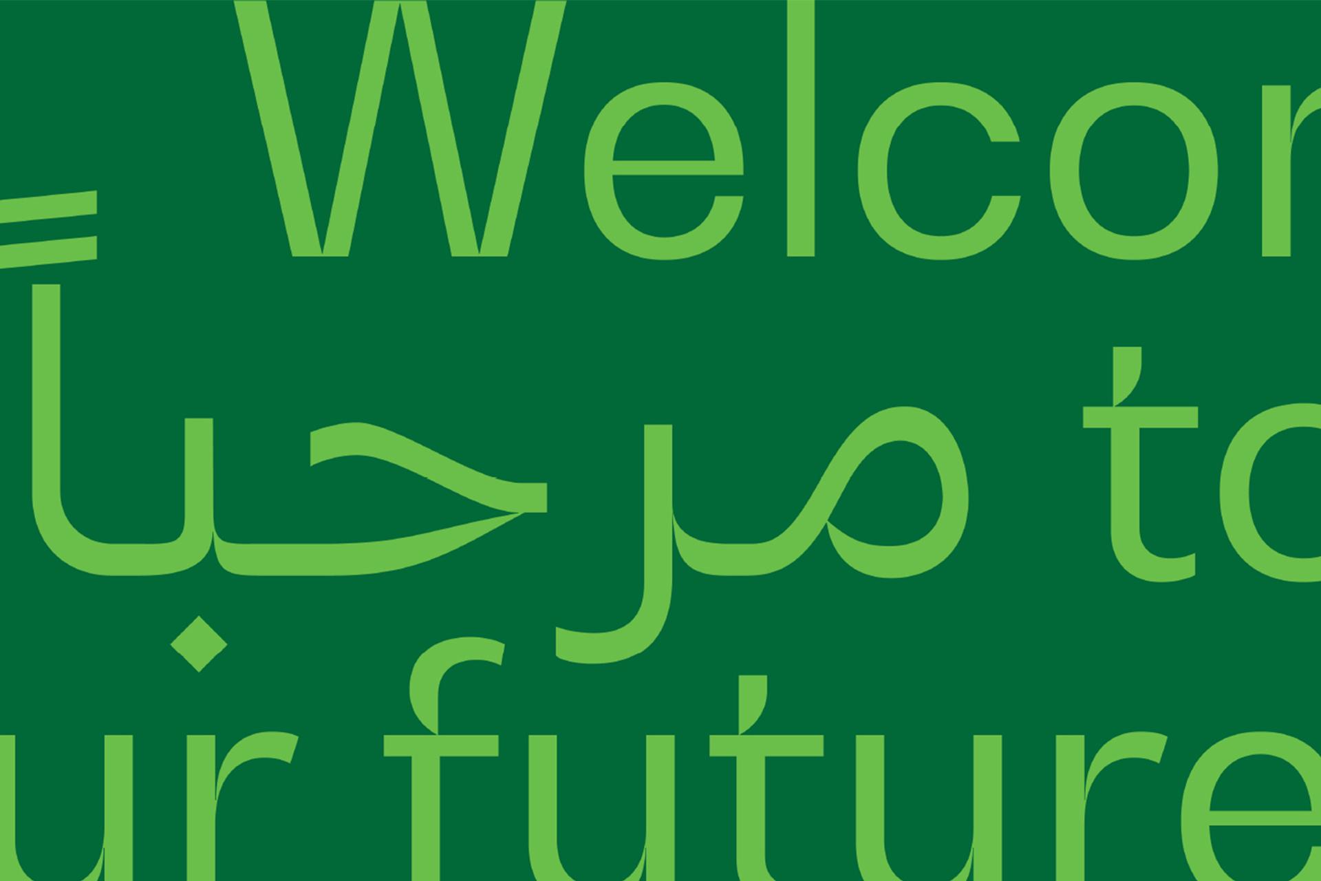
The rebrand breaks away from global airlines’ current brand practice by focussing on what makes Saudia Airlines unique – the Kingdom’s national identity. By embracing Saudia’s rich heritage, we combine nostalgia with the brand idea “Welcome to our future” to create a future-proof purpose fuelled by its legacy.
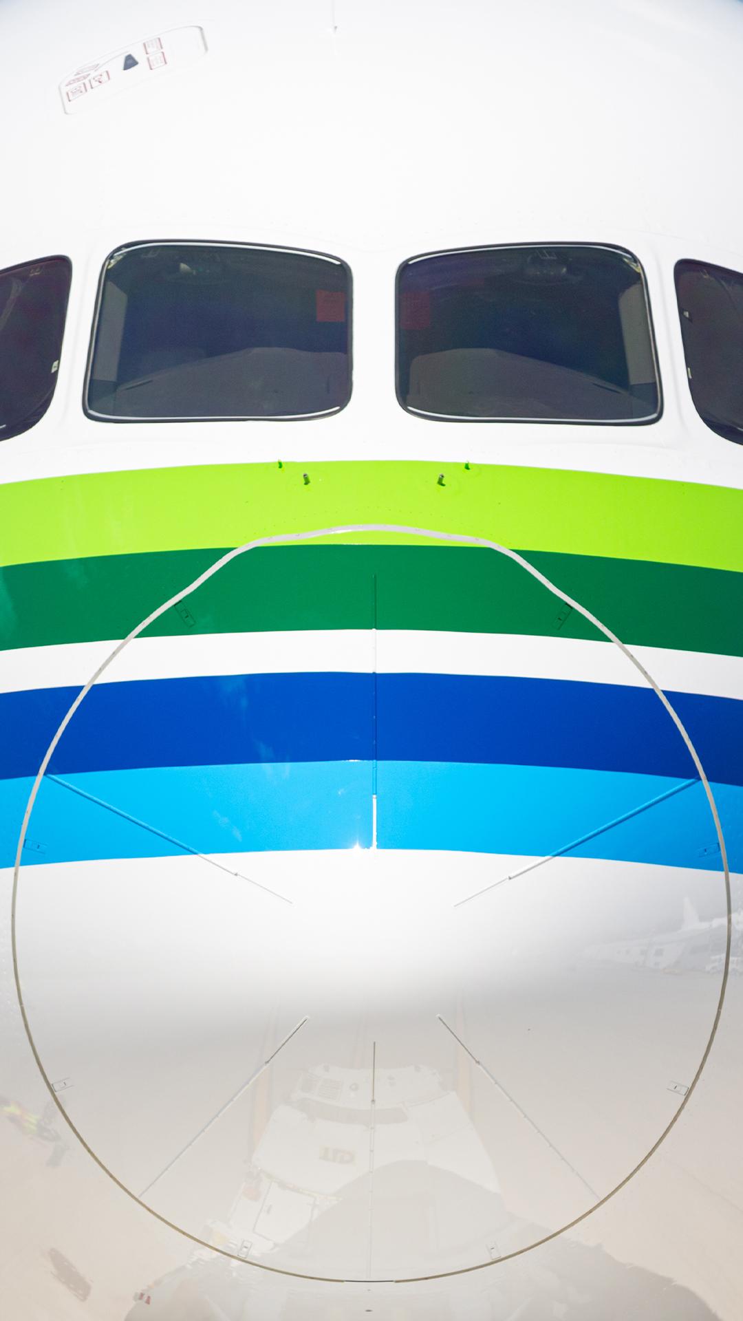
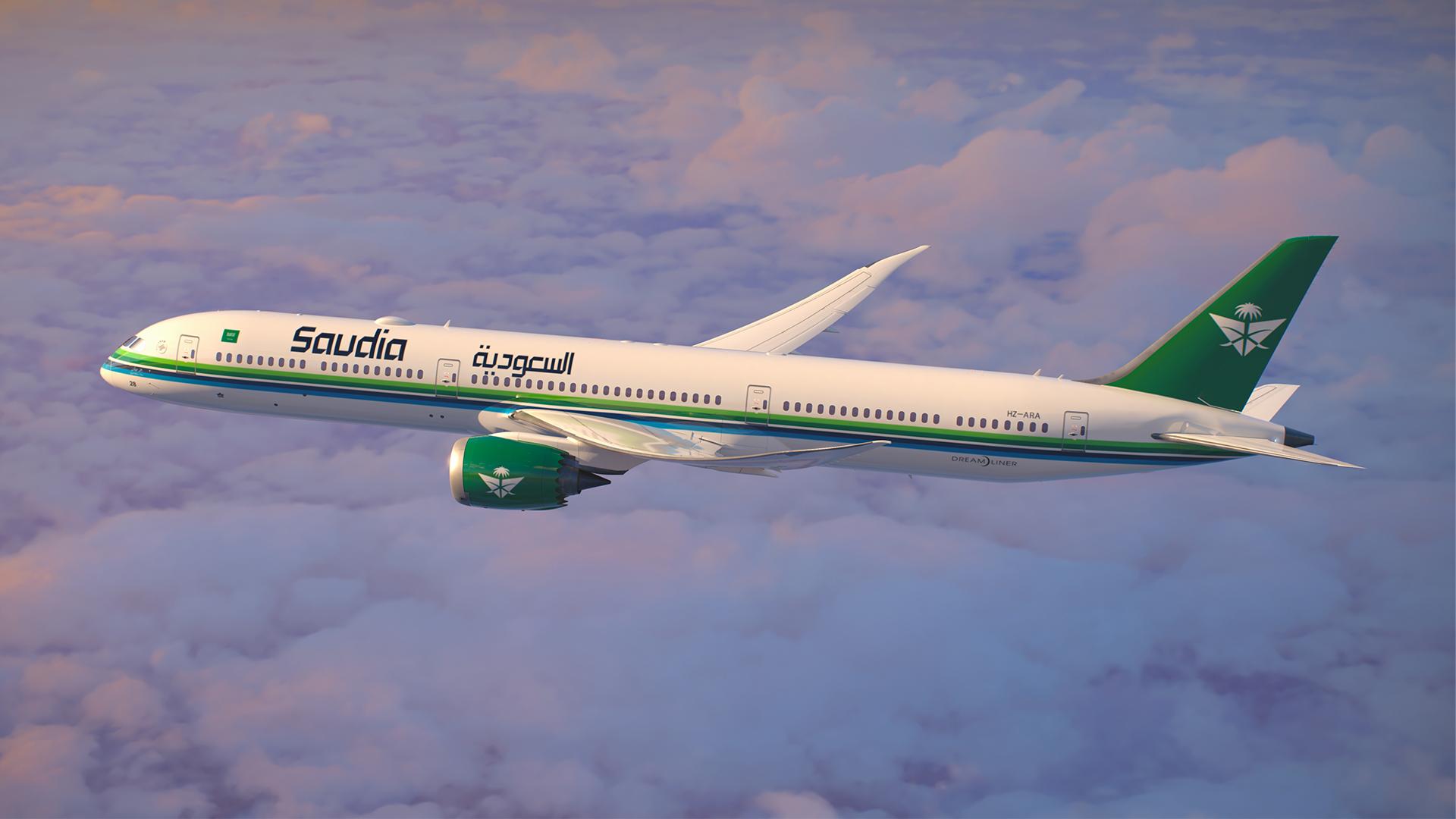
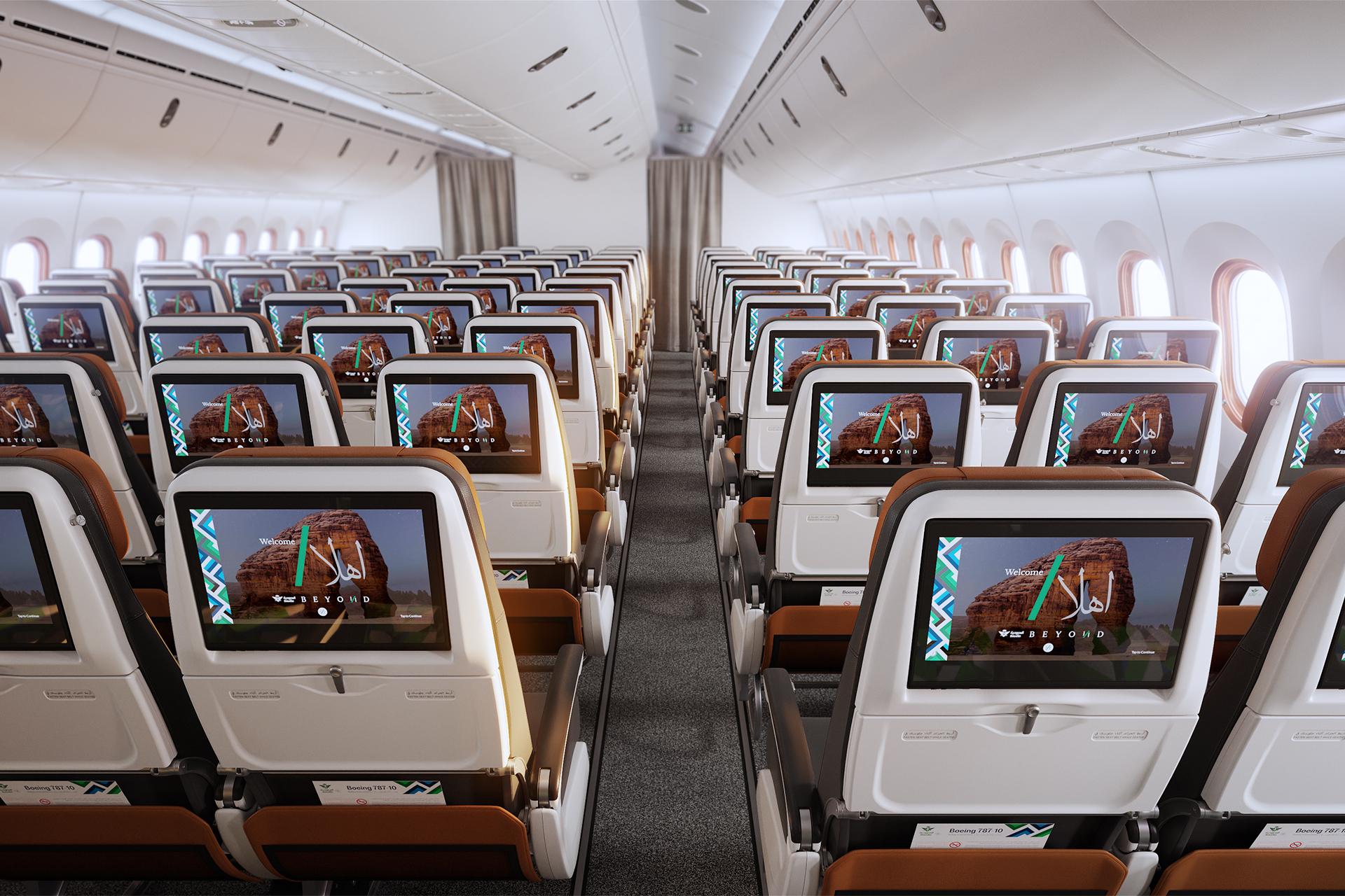
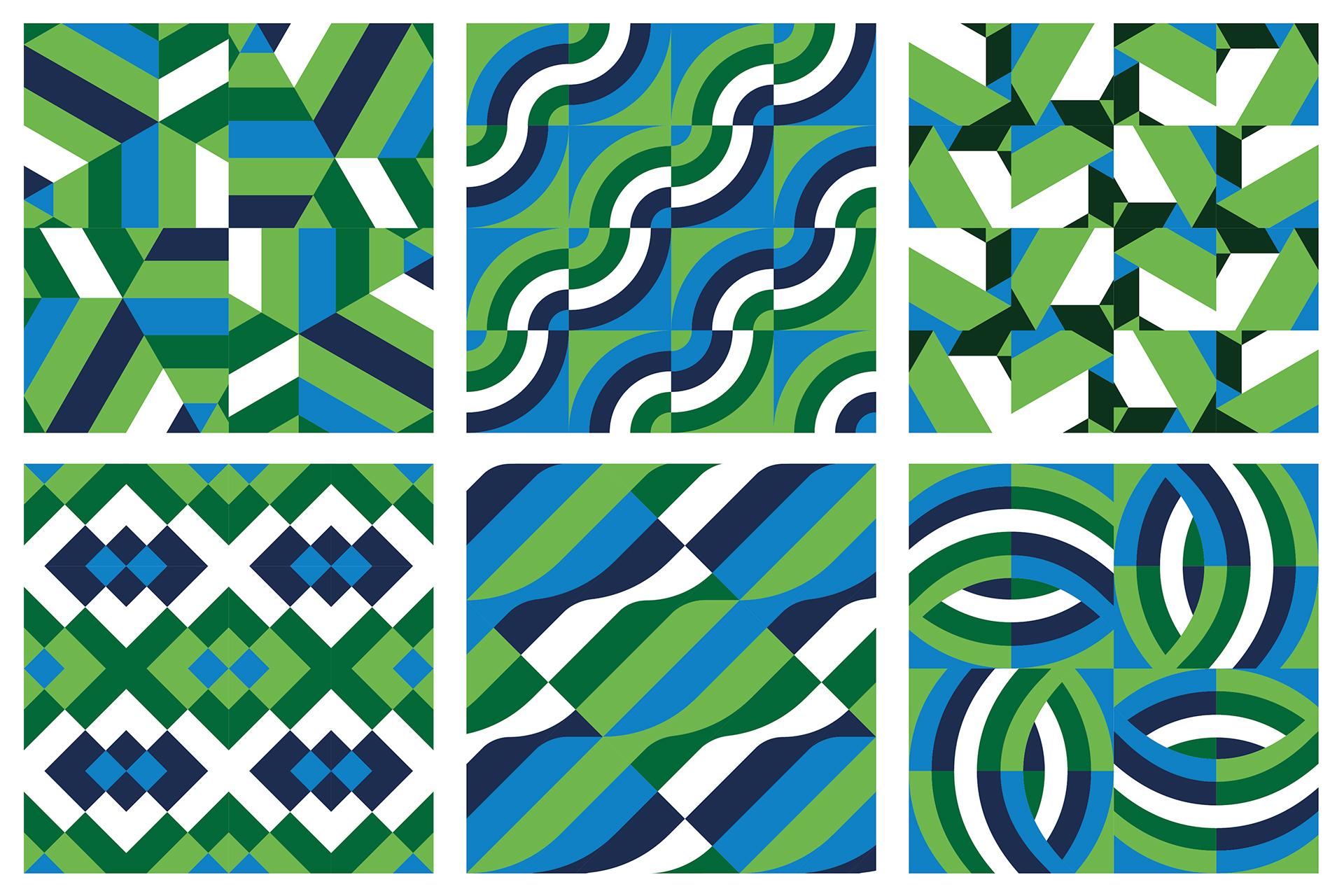
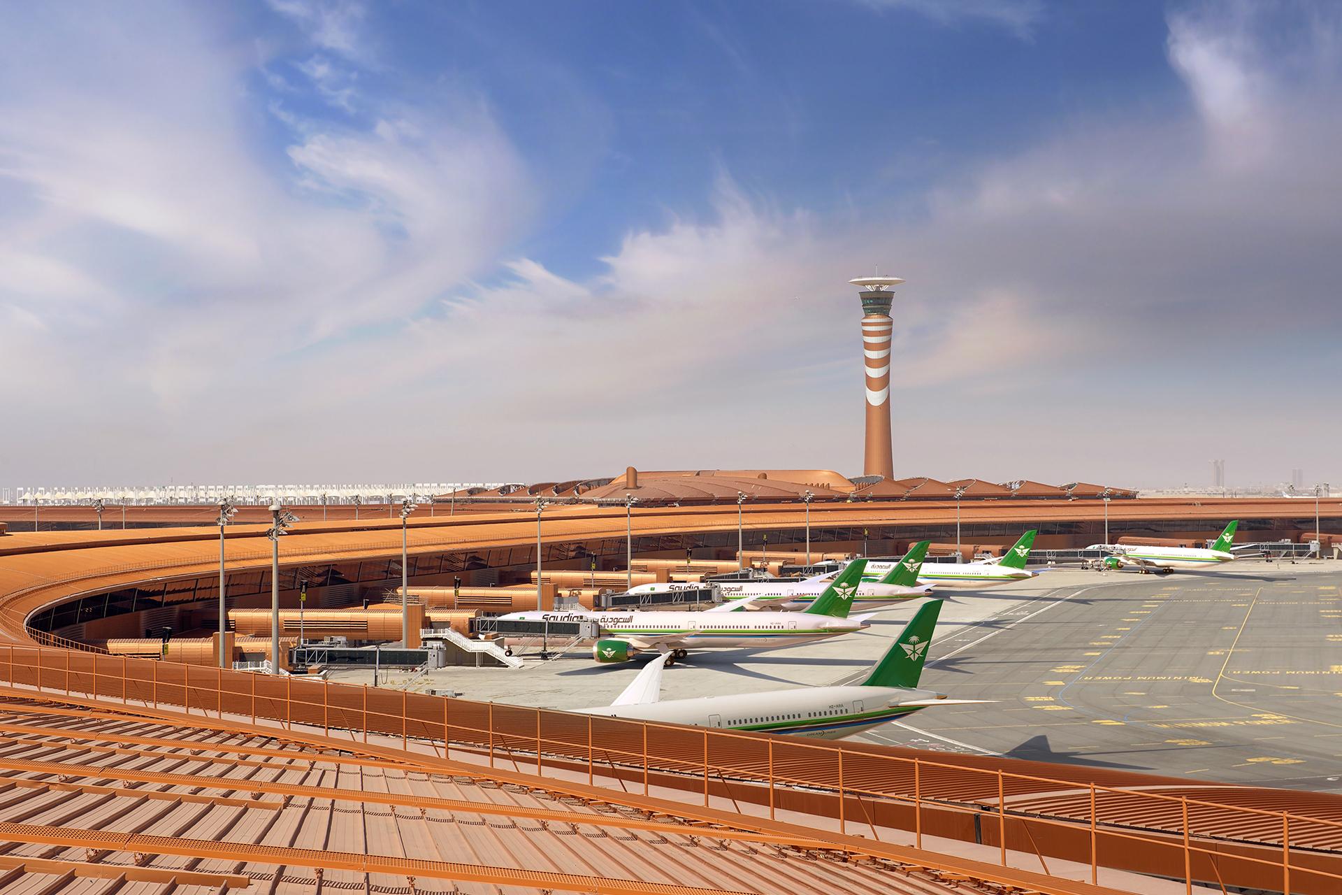
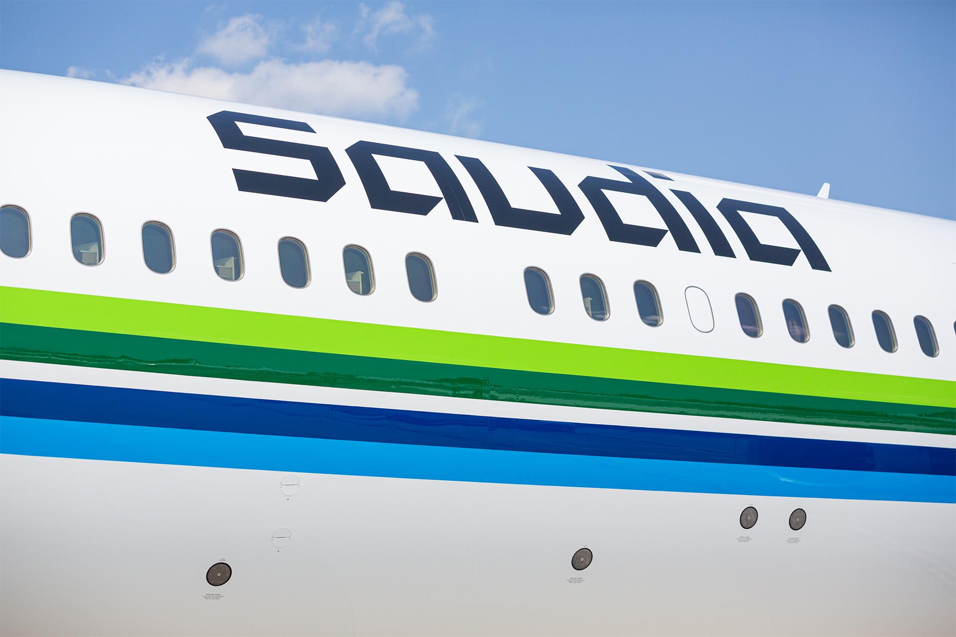
This immersive nature of branding extends beyond the visual identity, which features three distinct colours - green, blue, and sand - that celebrate Saudi culture and its deep-rooted values. These colours have been infused across the logo, colour palette, illustrations, and patterns to ensure the brand is synonymous with the Kingdom.
Coined as the Sound of Saudia, the sonic identity balances the authenticity and nostalgia of traditional music elements such as the Arda Dance, percussive beats, and regional instrumentation with modern, progressive notes to welcome all guests to Saudi while setting the stage for future growth.
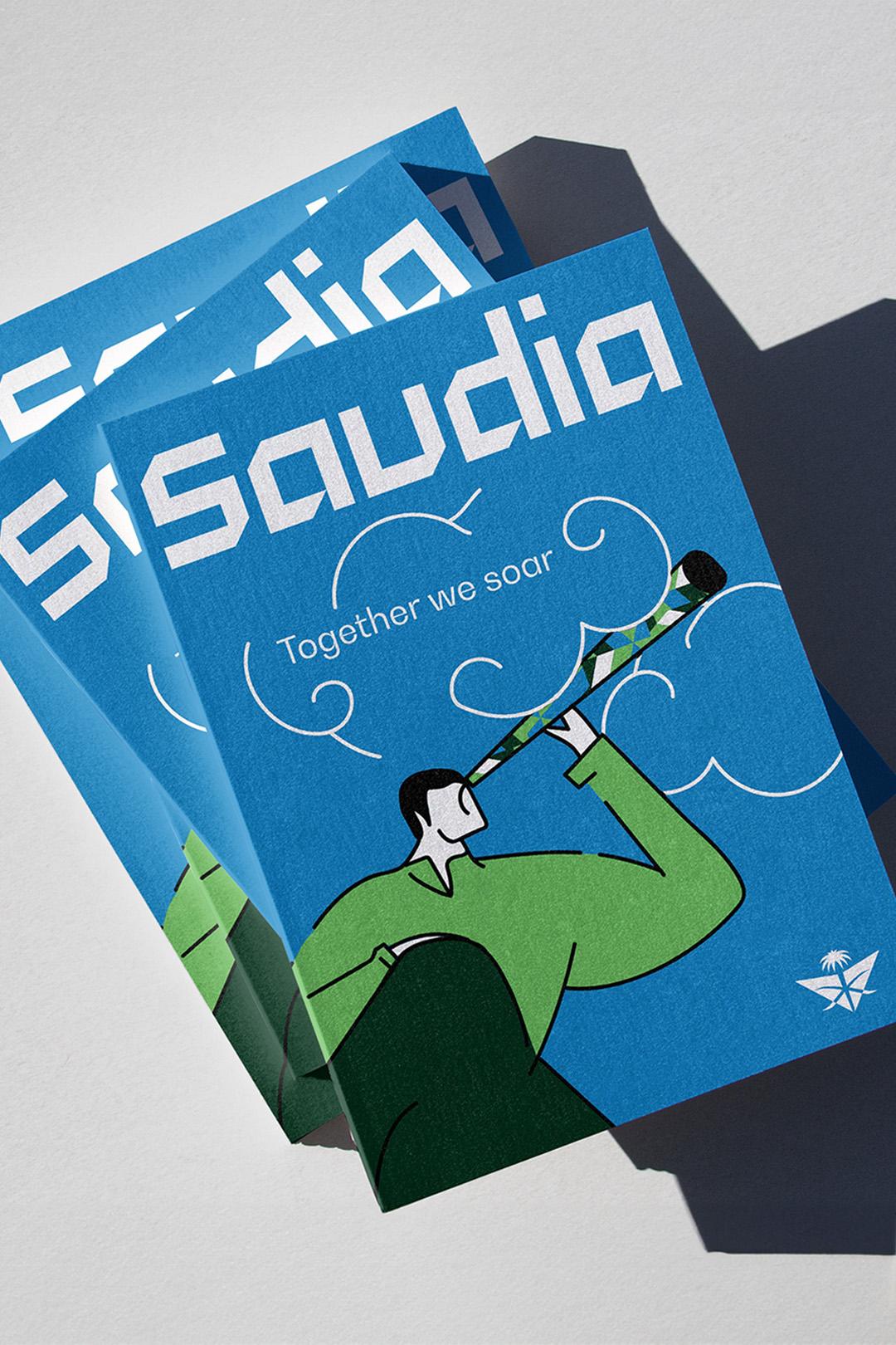
Dynamic new patterns represent the essence of Saudi Arabia, and our refreshed tone of voice accelerates Saudia into a new era.
Drawing inspiration from Arabic square Kufi for the wordmark’s typography, we redesigned the cross-sword emblem to evoke greater openness and warmth. Dynamic new patterns capture the essence of Saudi Arabia, while a refreshed tone of voice propels Saudia into a new era.
In addition, we reshaped Saudia’s and the Group’s architecture as part of this extensive rebrand. By streamlining their products, services and business lines, we've created a balance between scale and clarity. This strategic makeover has further solidified Saudia’s brand identity, ensuring it echoes powerfully across all facets of the business.
MILES AHEAD
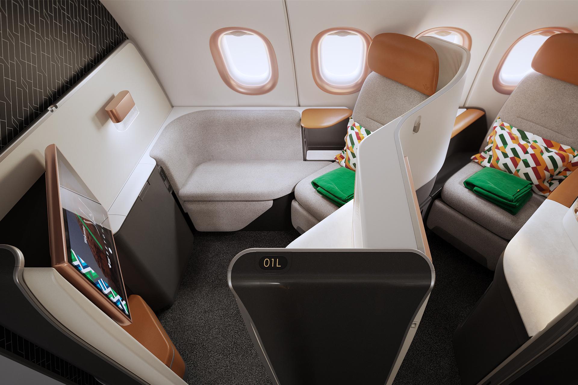
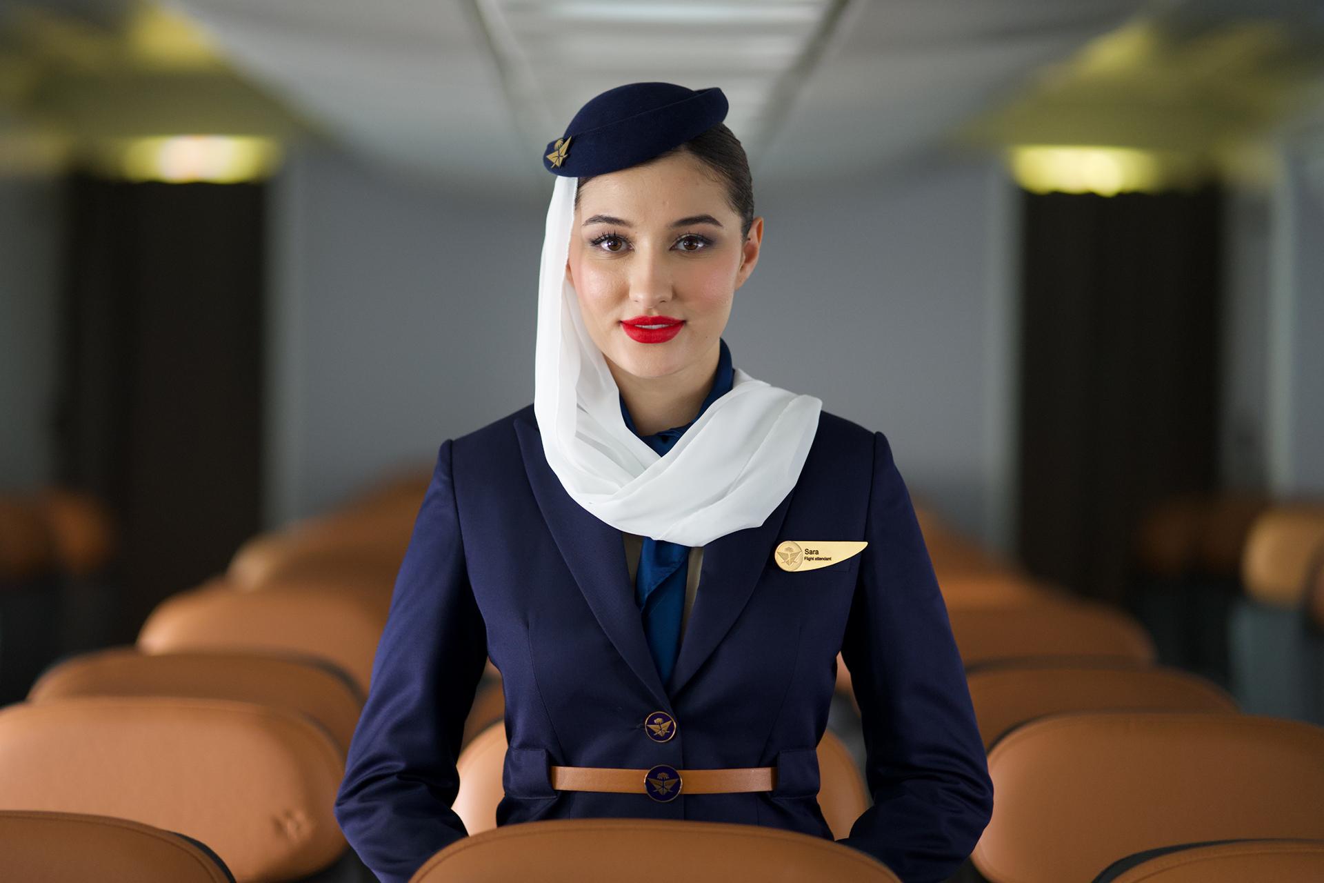
Saudia Airlines, the largest employer in Jeddah, has ensured that its talent are part of the audience for its new transformation. The rebrand was implemented across the entire Saudia Group, including subsidiary companies, the airline, cabins, lounges, uniform, onboard interfaces, website, app and all key customer touchpoints, making it one of the most extensive rebrands Landor has ever created.
“Saudia Airlines is the most iconic brand in Saudi… Our name and logo are an integral part of the Kingdom’s aviation history and development. It was important that we play into the emotional connection Saudis have with the elements of our brand and restore them to suit today’s world. Our new identity reflects our visionary approach, poised to captivate the world.” Khaled Tash, Group Chief Marketing Officer, Saudia Group
SAUDIA SOARS
Saudia Airlines' rebrand has taken off with incredible momentum. In just two years, brand value soared by 80%, reaching $797.4 million and securing Saudia's position as the sixth fastest-growing airline brand globally. This success is echoed in accolades like "Most Improved Airline in the World" (Skytrax) and "Most Trusted Saudi Brand" (Ipsos), reflecting a complete transformation.
This positive shift translates to tangible results: passenger numbers and sales are up over 20%, while profitability has skyrocketed by 88%. This success story is deeply intertwined with Saudi Arabia's Vision 2030, exemplified by a $19 billion deal with Airbus for 105 aircrafts, solidifying Saudia's commitment to growth, tourism and economic progress – a commitment recognised by their ranking as the “Most Recommended Brand in Saudi” (YouGov).
