THE STORY
FREEDOM OF TRAVEL
The simplicity of Eurotunnel LeShuttle’s story held unique benefits – ones that people just weren’t aware of. The brand needed to celebrate convenience and sustainability, remain distinct from competitors Eurostar, and appear front-of-mind for a new generation of audiences.
PACES, PLACES, FACES
With a complete refresh, we re-established the brand as a relevant and unique form of transport, speaking to every pace, place and face.
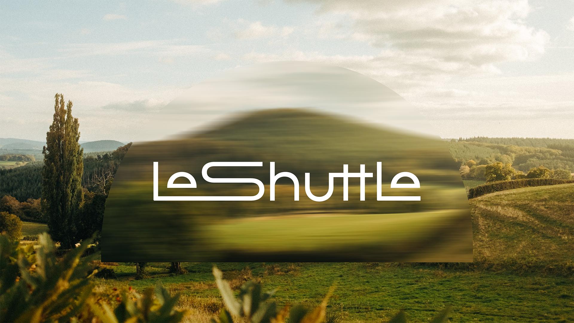
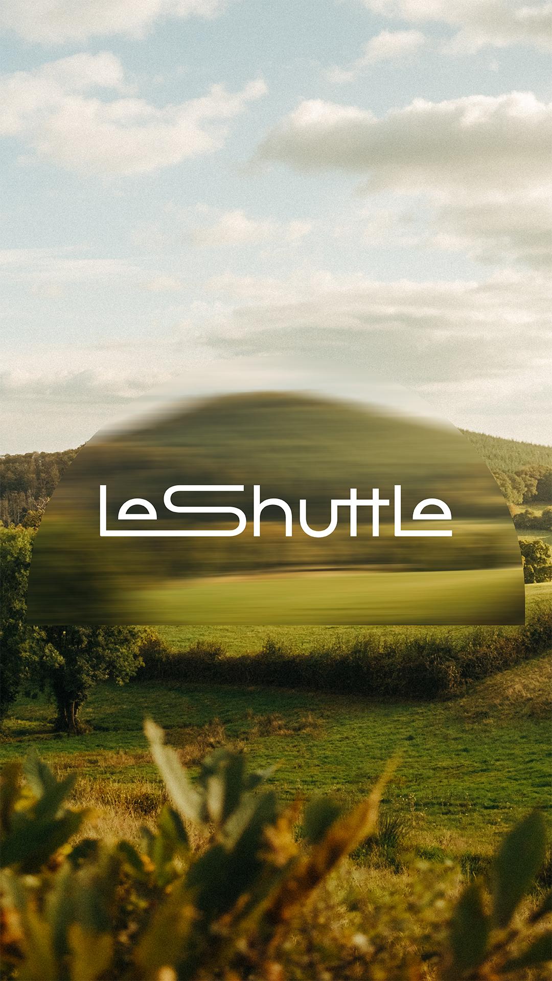
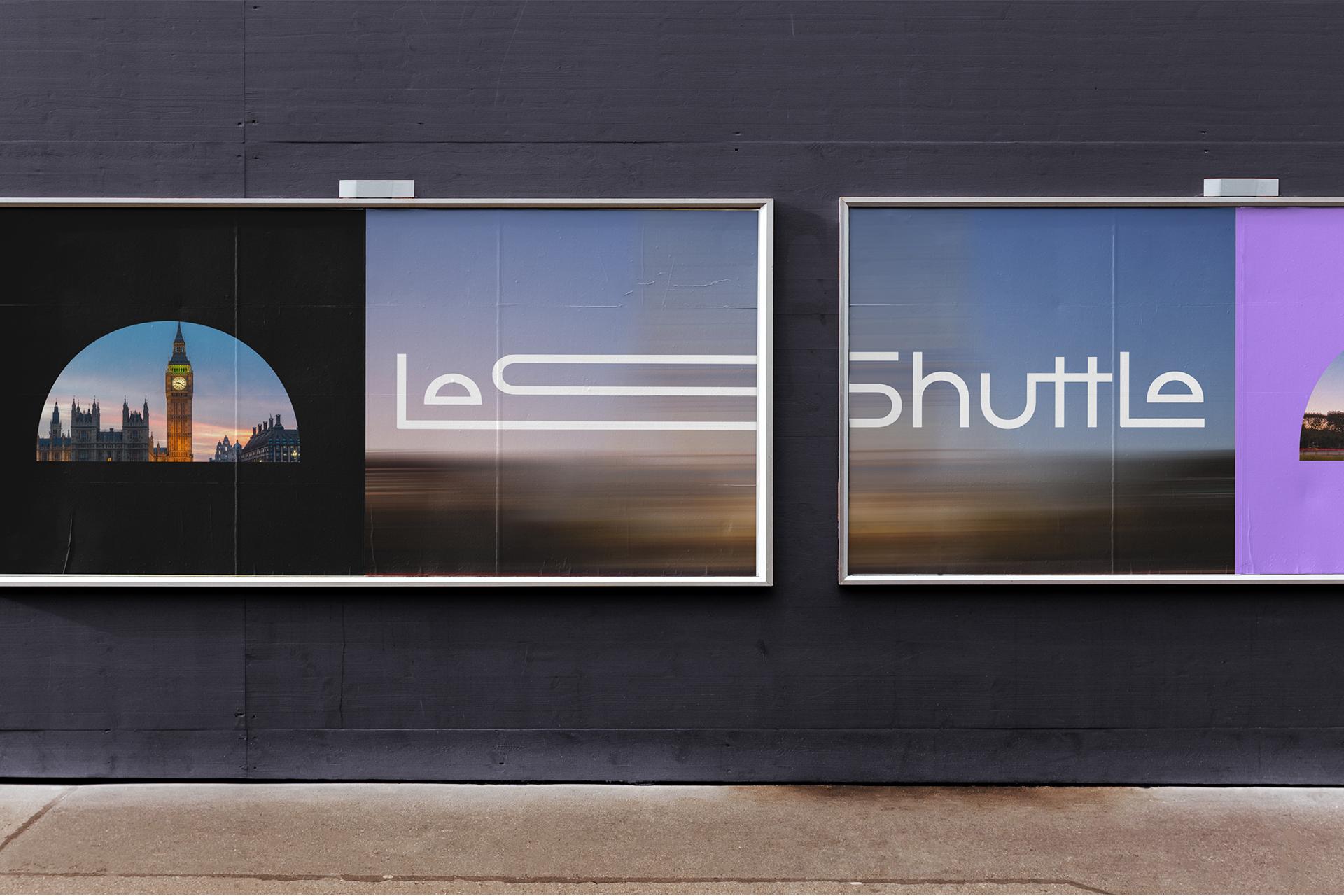
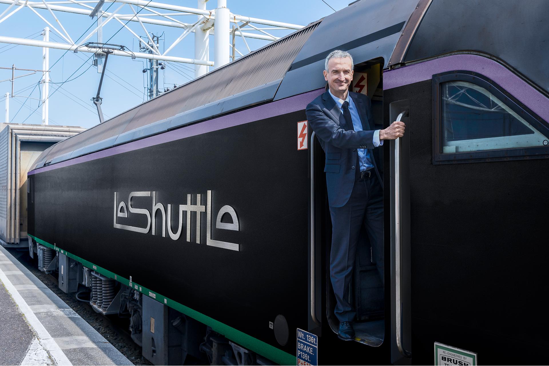
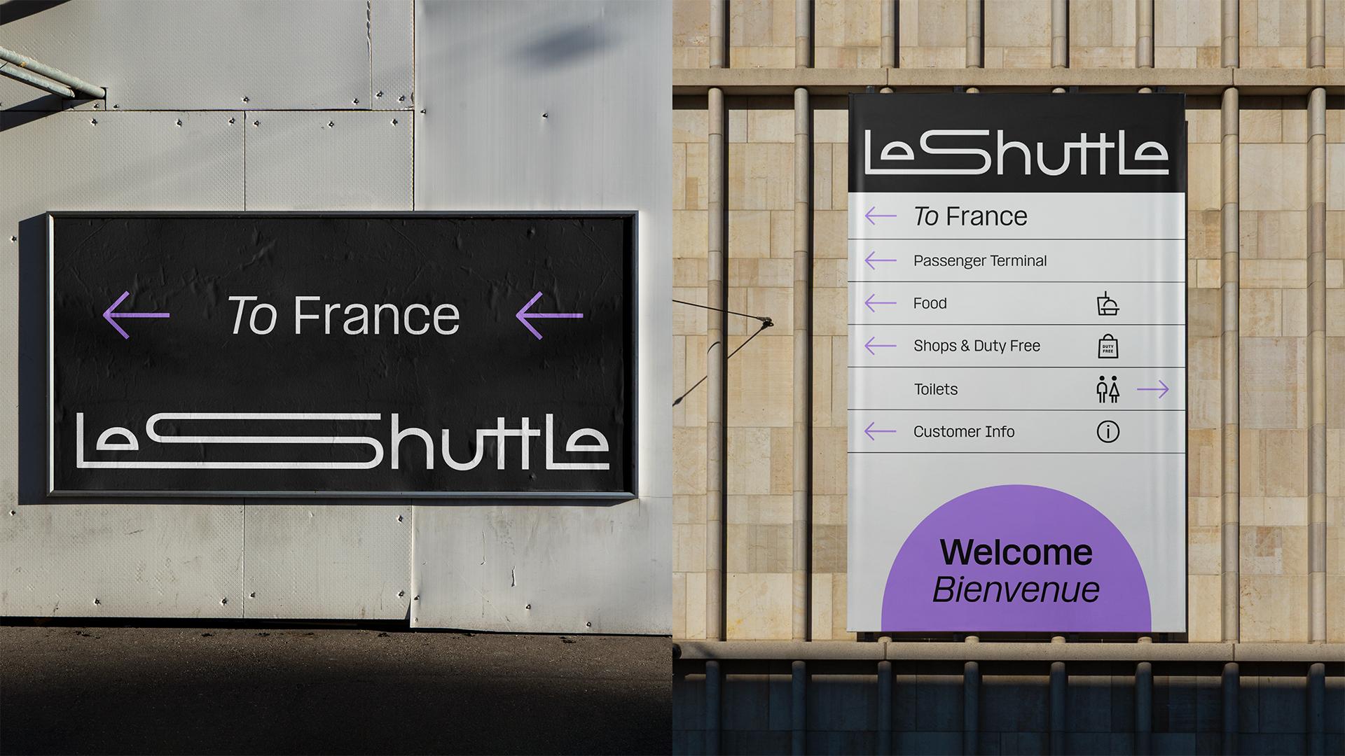
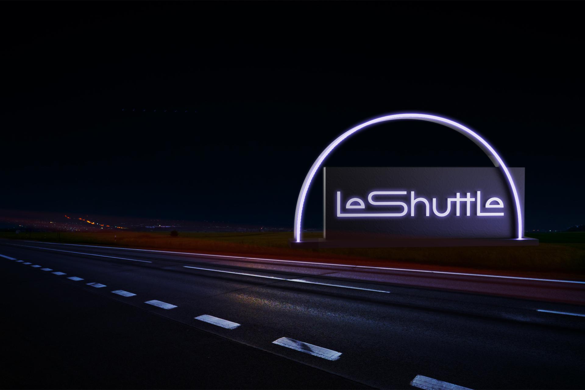
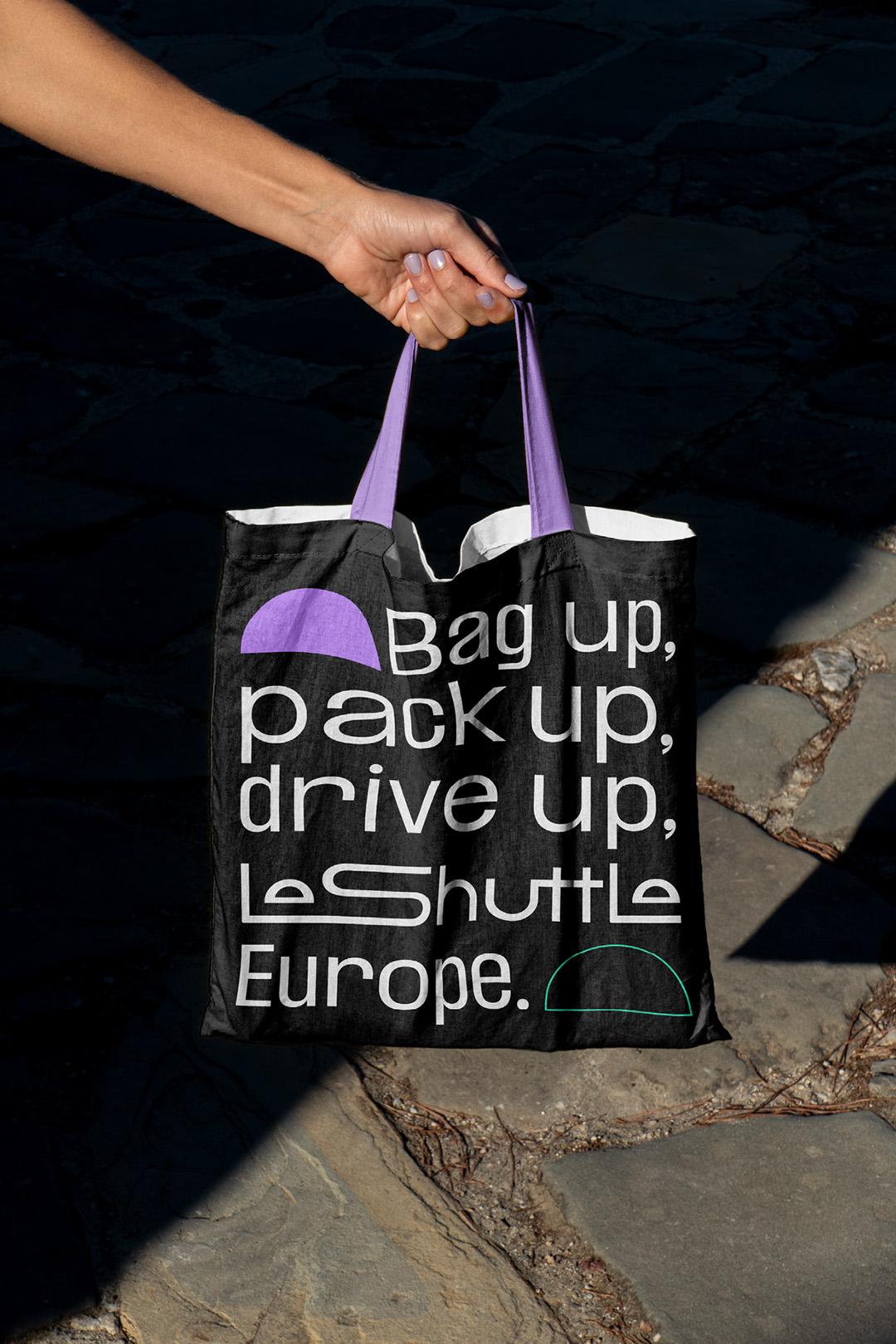
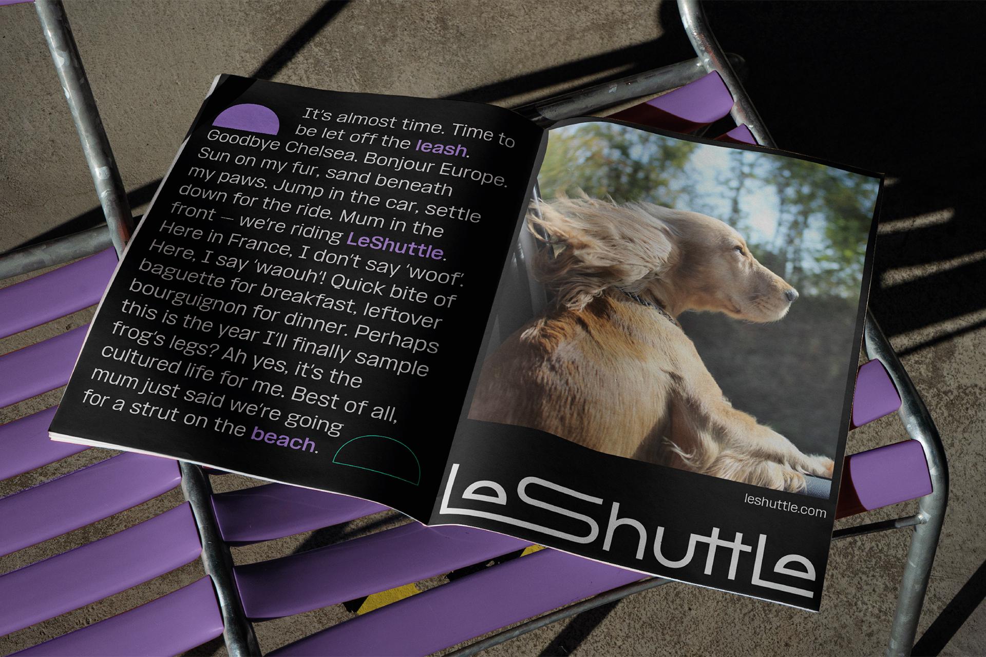
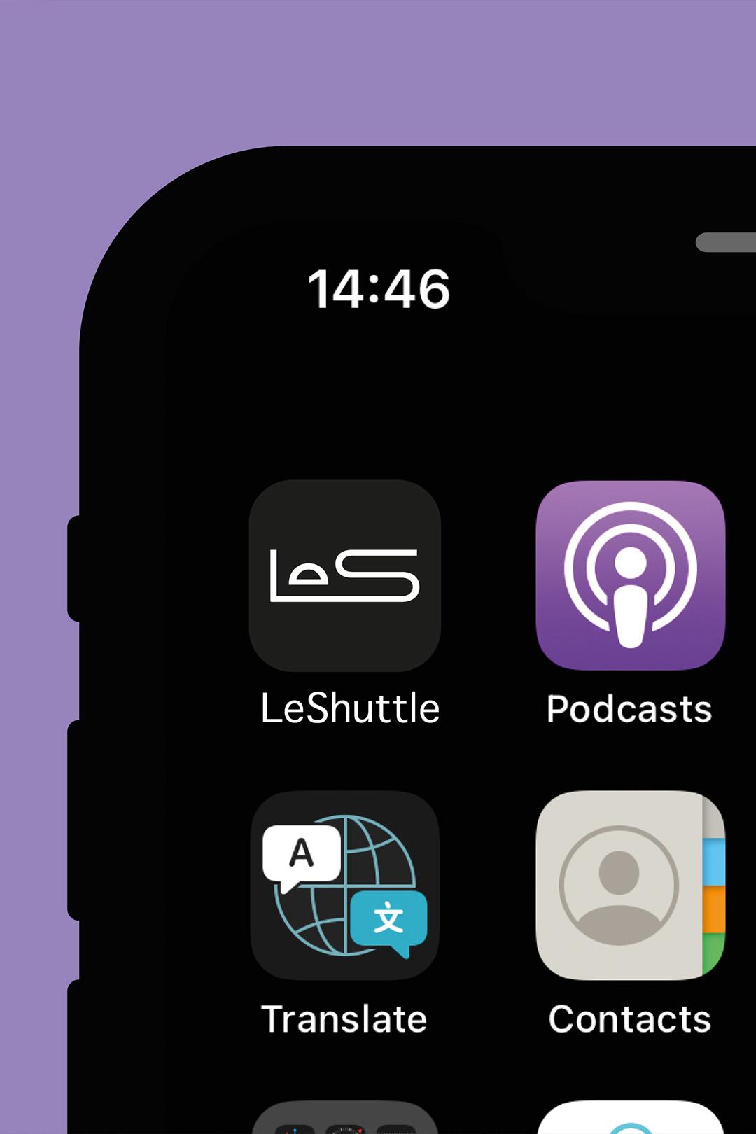
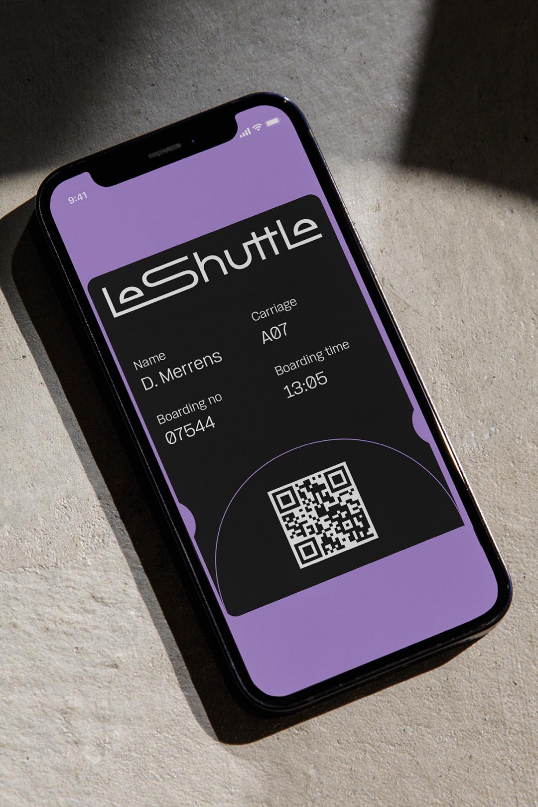
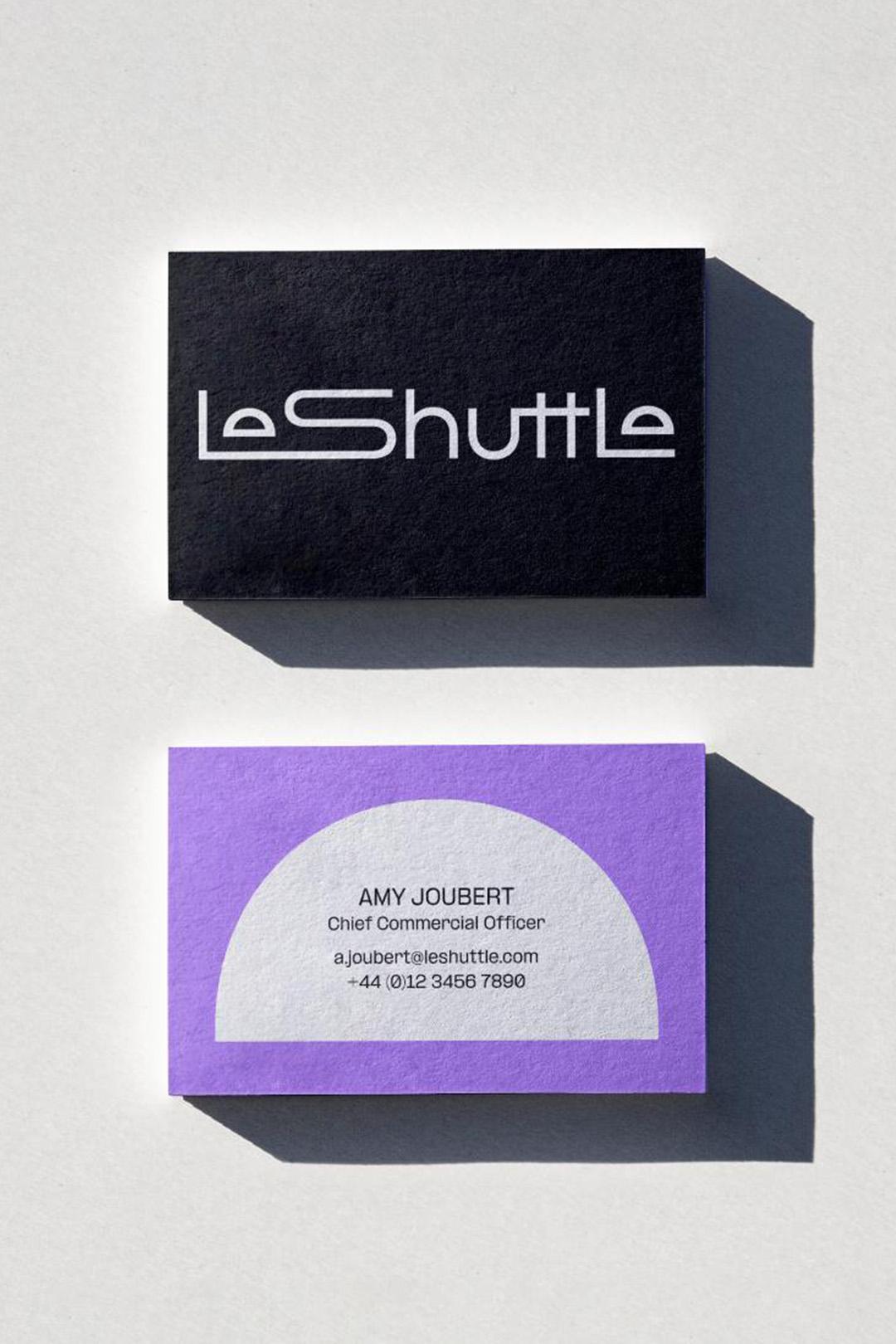
‘Your way’ drives the new brand, with a simplified new name removing competitor confusion and positioning the brand as a service, not an infrastructure. With this, a new logo, typeface, colour palette, photography style and brand voice come together to celebrate the freedom of travel on your terms.
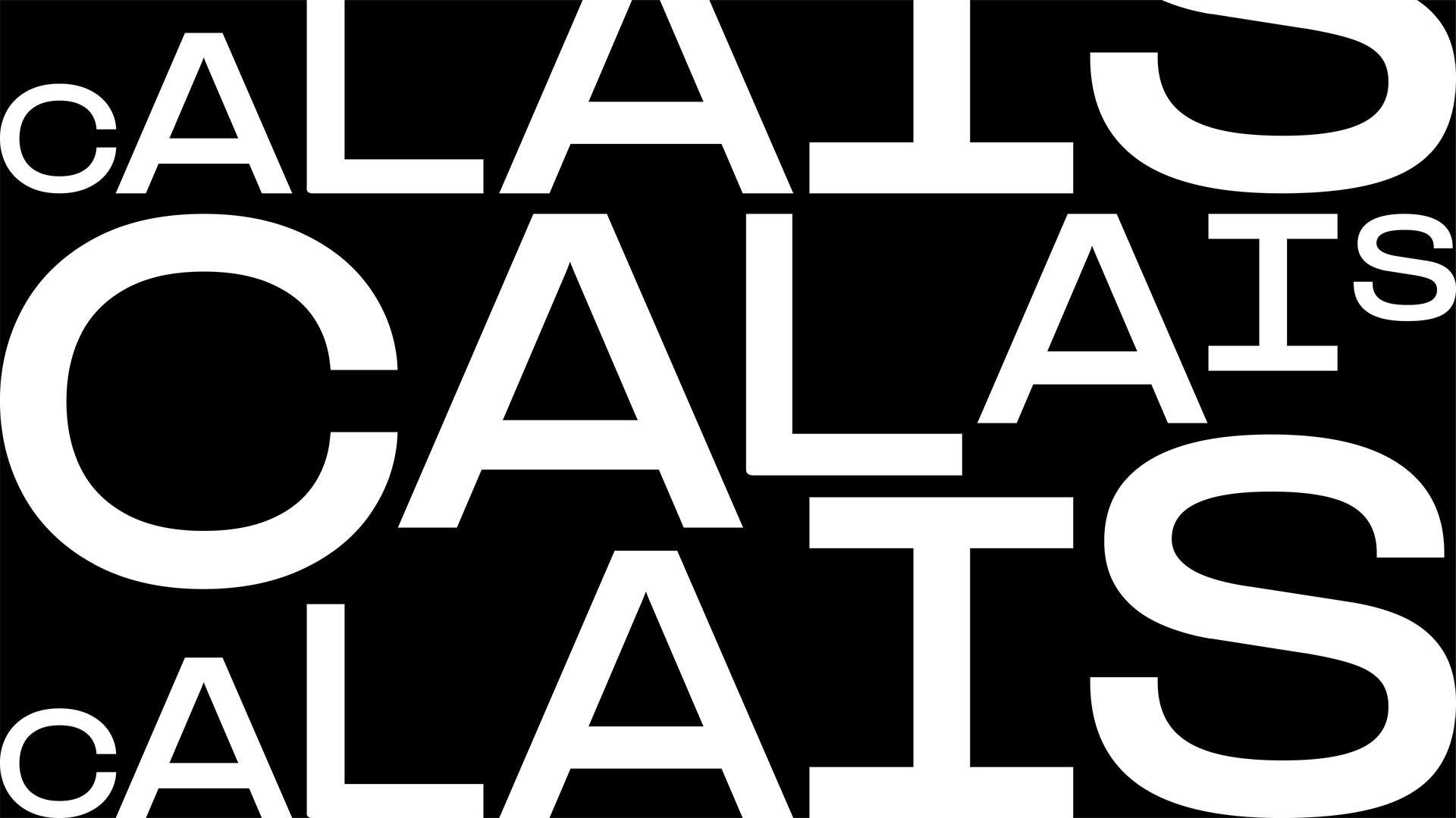
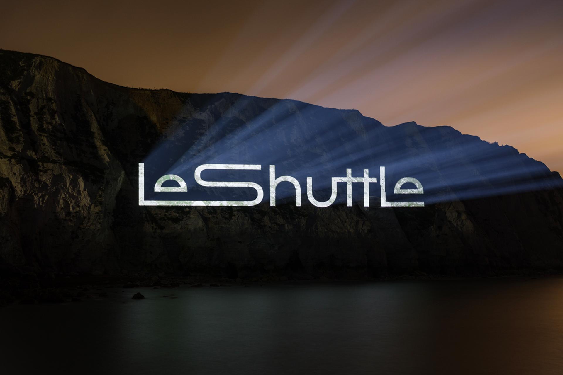
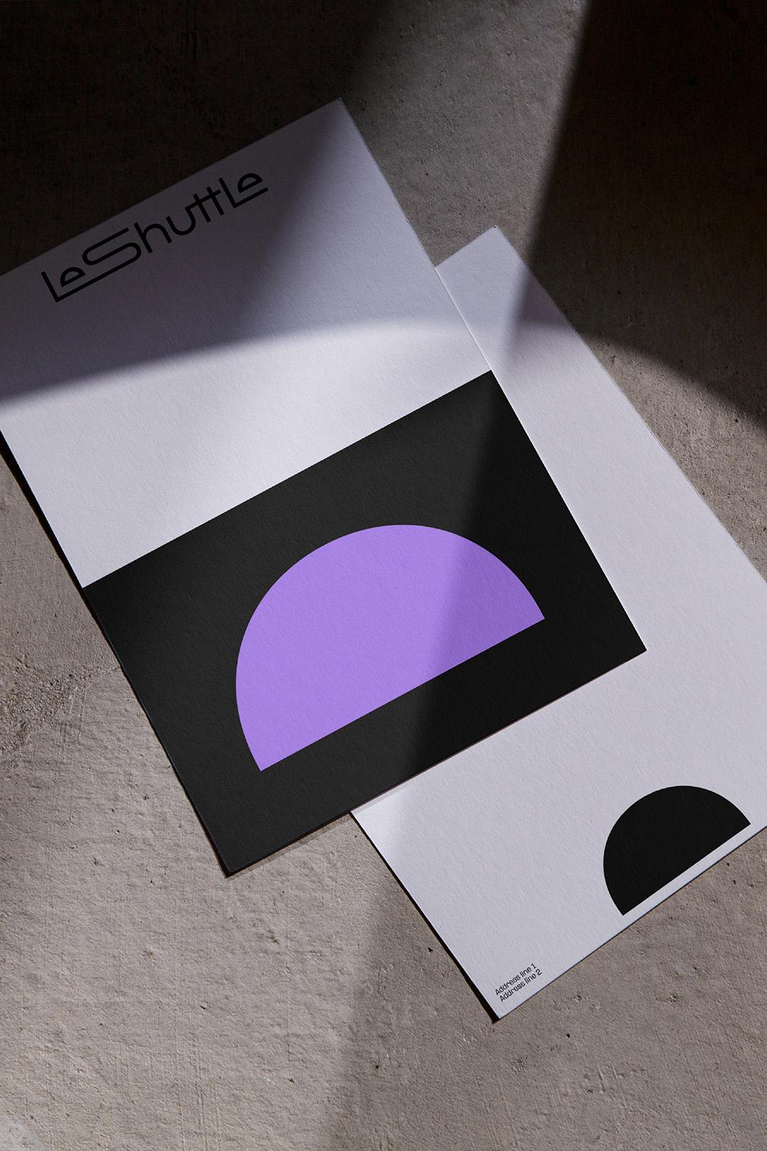
The creative journey began with an iconic wordmark. A celebration of speed and ease, it conveys freedom through our new tunnel device. Representing the start and end of each adventure, this device is central to the brand, creating a portal to new experiences.
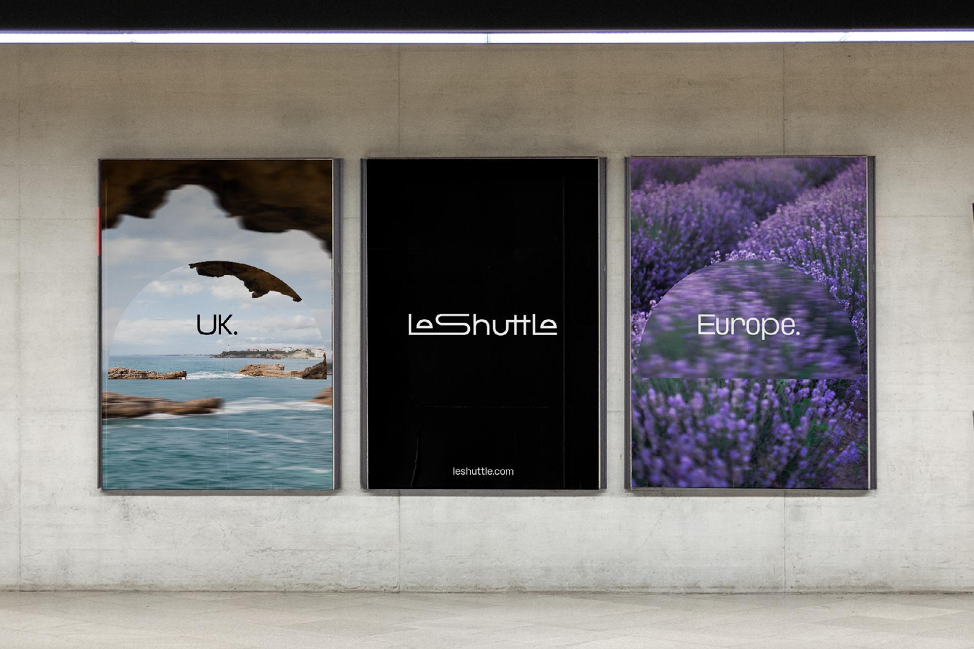
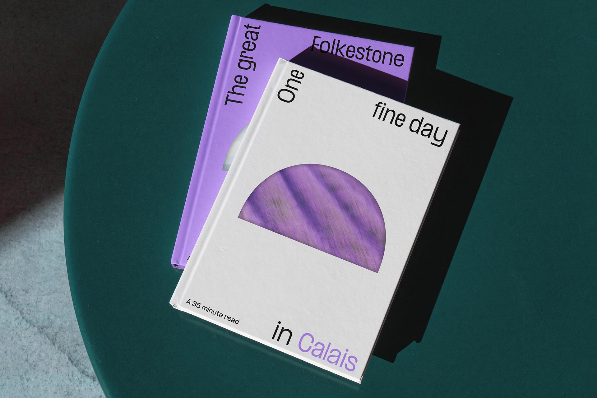
Human elements counter the sleek, predominantly black and white colour palette, with accents of coast, cliff and lavender field, a perfectly imperfect user-generated photography style, and a custom expressive typeface.
Our new verbal identity also gives voice to the freedom of ‘your way’. Three-part headlines reflect the before, during and after of each trip, with flexible story lengths and playful comparisons speaking to every pace, place and face.
ON TRACK FOR ANOTHER 30 YEARS
This new, future-facing brand lives across every touchpoint, from terminals to TV, socials to uniforms. It propels LeShuttle into their next era, while retaining the human idiosyncrasies of travelling your way – a contrast that sets the brand apart for years to come.
“The promise of speed and service is delivered in the new LeShuttle brand. A new, forward-focused identity to tell our story and welcome a new era of travel” — Yann Leriche, Chief Executive Officer at Getlink
CHANNELLING GOLD
Since launch, LeShuttle has outperformed the previous brand across speed, ease and sustainability, with a 69% rise in perception of innovation across age groups, a 53% rise in consideration amongst 35-44 year olds and a 6% rise in passenger volume.
“With all extraneous details removed… LeShuttle embraces futuristic simplicity” — It’s Nice That
“From the fun typography to the energetic photography, this is an excellent rebrand that evokes the excitement of travel in every bit of the communications.” — Transform Awards Europe
Transform Awards Europe
Gold for Best Visual Identity from the travel and tourism sector
Gold for Best brand evolution (consumer)
Silver for Best naming strategy (rename)
Silver for Best use of typography.