THE STORY
A MOBILE FIRST
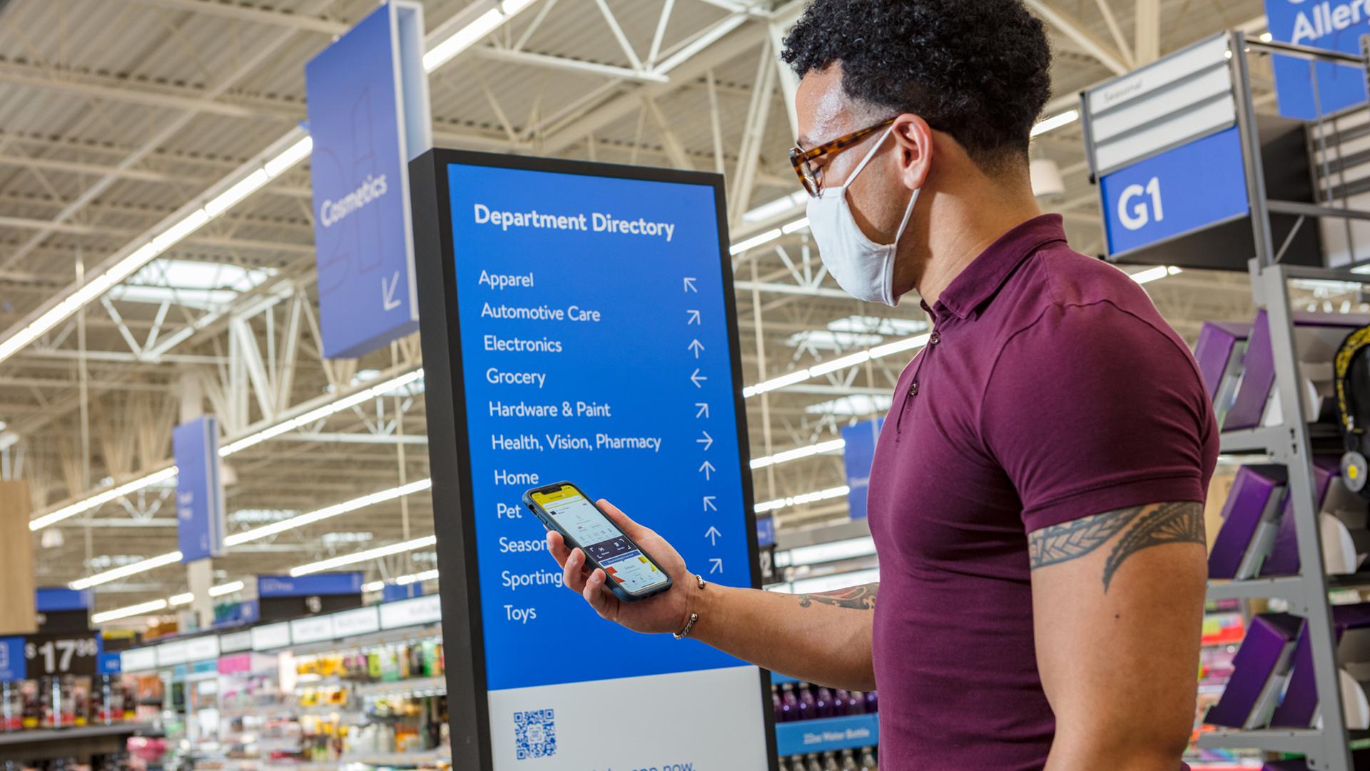
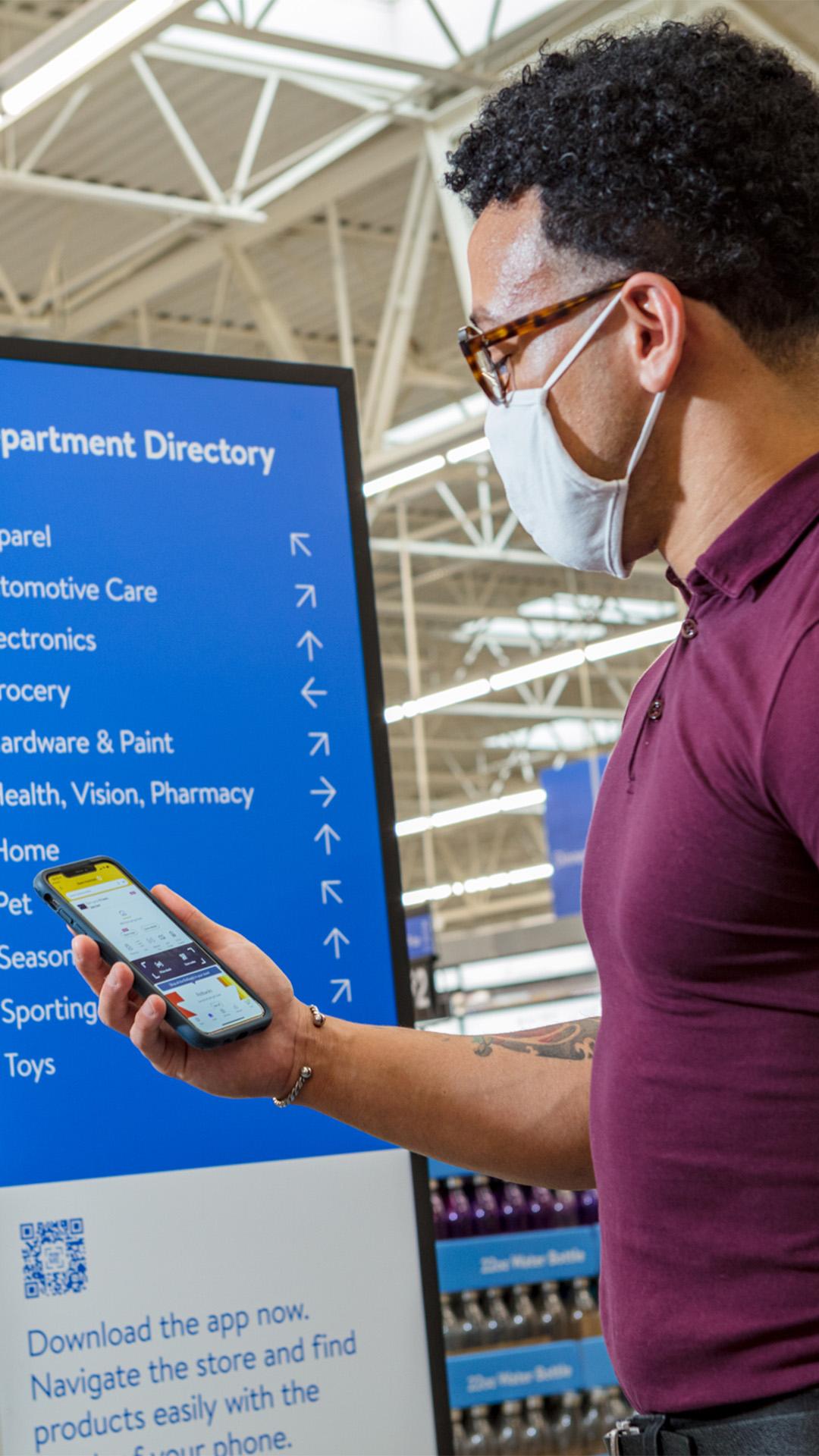
We drew inspiration from Walmart’s overarching idea of ‘Save money. Live better.’ to create the experience signature ‘Time well spent’. This informed our retail innovation, ‘Swipe Up’, which seamlessly blends physical and digital retail worlds. This ensures that every moment matters for customers, with real-life shopping experiences led by the virtual world. ‘Swipe Up’ centres on bold, purposeful and intuitive navigation that puts the customer in control.
SWIPE RIGHT ON SHOPPING
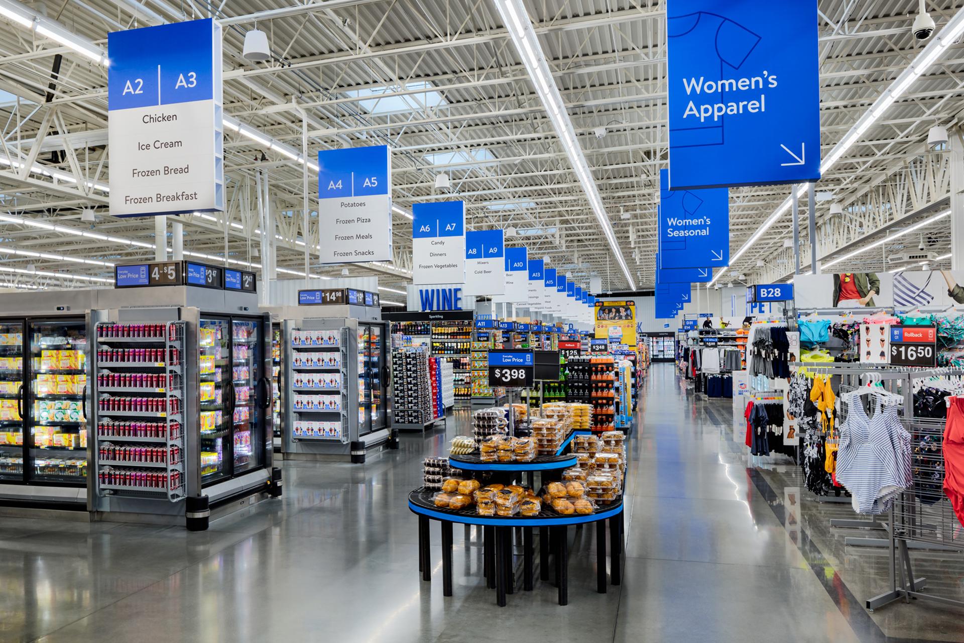
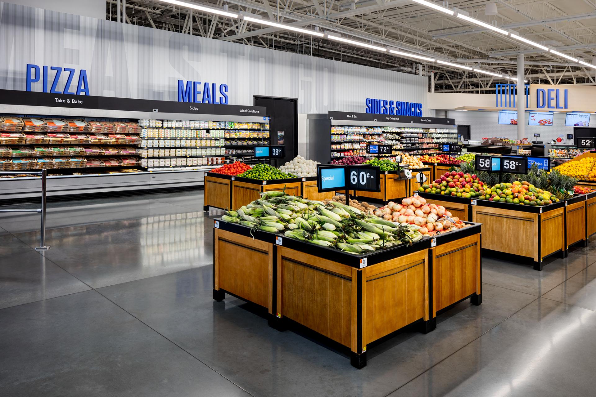
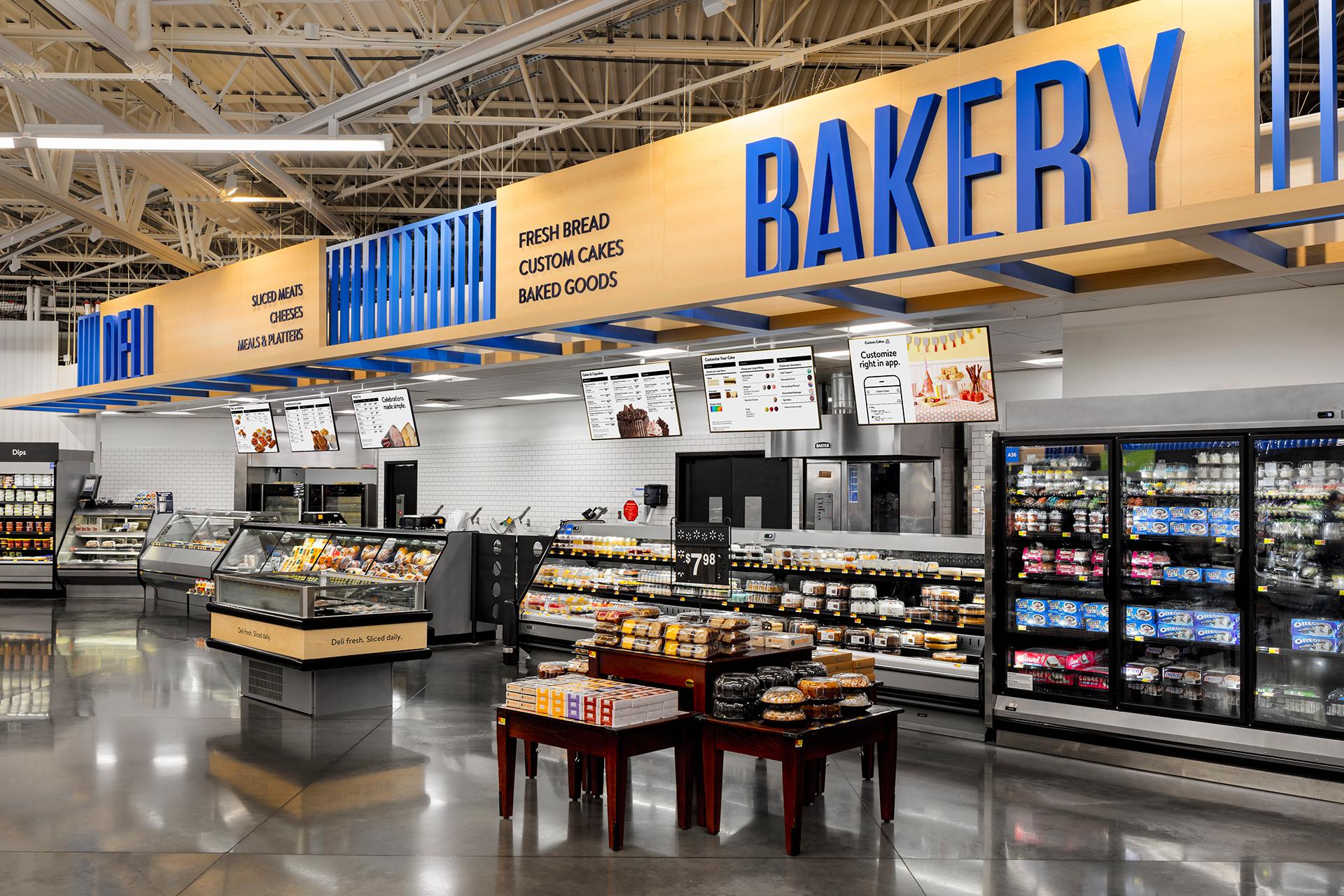
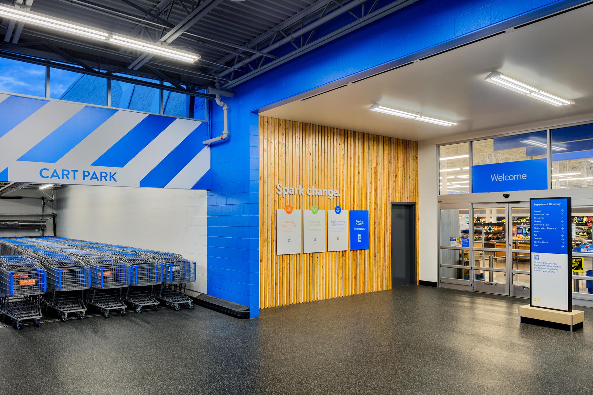
We set a new bar for customer journey mapping. With power in their hands, customers were able to explore stores that reflected app content. Physical typeface, number and letter combinations echoed those in-app, creating seamless transitions between physical and virtual worlds. Together, these transformed shopping into a fluid, freeing experience.
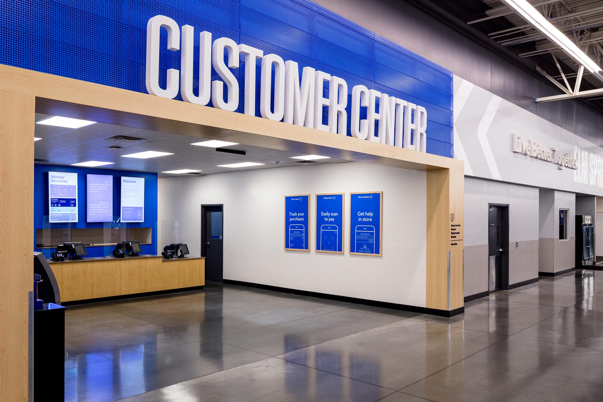
Our customer-centric, brand-led service design changed the look and feel of stores – and shopper behaviours too. Taking them on a stress-free route to the products they needed, we gave them more time for browsing other products and services.
RESULTS
Fast adoption — 1,000+ store rollouts by end of 2021.
High profile press — Including, Fast Co, AdWeek, AdAge and USA Today. Swipe Up press coverage gained over 1 million impressions worldwide.
Award winning — Recognised at World Retail Awards and Retail Design Institute.
