
THE STORY
SAME GAS. NO SPARK.
Georgia opened its gas market to competition in the late nineties, leaving one pipe and many sellers. The gas is identical. The delivery is identical. Only the price changes, training customers to compare numbers rather than connect with brands.
SCANA Energy faced the same challenge as everyone else: how do you build preference when the product leaves almost no room to differentiate? The answer wasn’t to invent a difference. It was to build around the one customers could already feel.
THE REAL POWER MOVE
Our brand analysis uncovered an opportunity hiding in plain sight. While price drove the first glance, customer service drove the lasting impression. Customers described the category as confusing, opaque and difficult to trust. SCANA Energy, however, consistently outperformed competitors on service perceptions. Not a claim you can invent. A truth that simply wasn’t being rewarded. So we stopped building a better product story and built a better brand role.
SOUL SEARCHING
Our strategy ‘Gas that warms your home with service that warms your soul’ was simple, emotional, and operationally real. It moved SCANA Energy from gas provider to something more human: a company that not only keeps homes warm, but improves everything around the experience of heating them.
Energy doesn’t live in the pipeline. It lives in the lights left on for someone coming home late. The dinner warming on the hob. The house finally warming up on a crisp winter morning.
If service was the emotional differentiator, the brand needed a symbol that could embody it. Which left one question. What does that feel like?
HOME TRUTHS
Most rebrands begin by asking what to remove, and the mascots usually go first. Too soft, too old, too cartoon for a company that wants to be taken seriously.
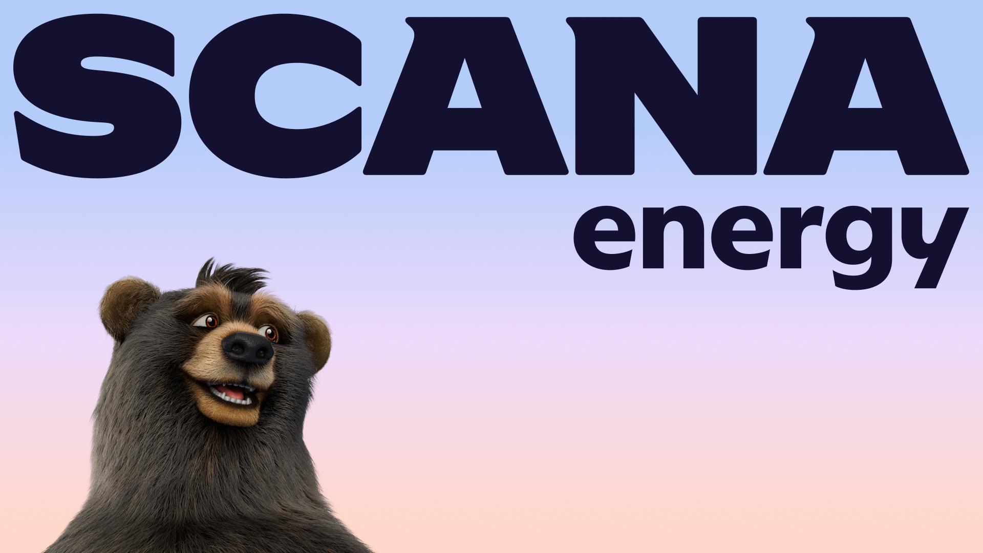
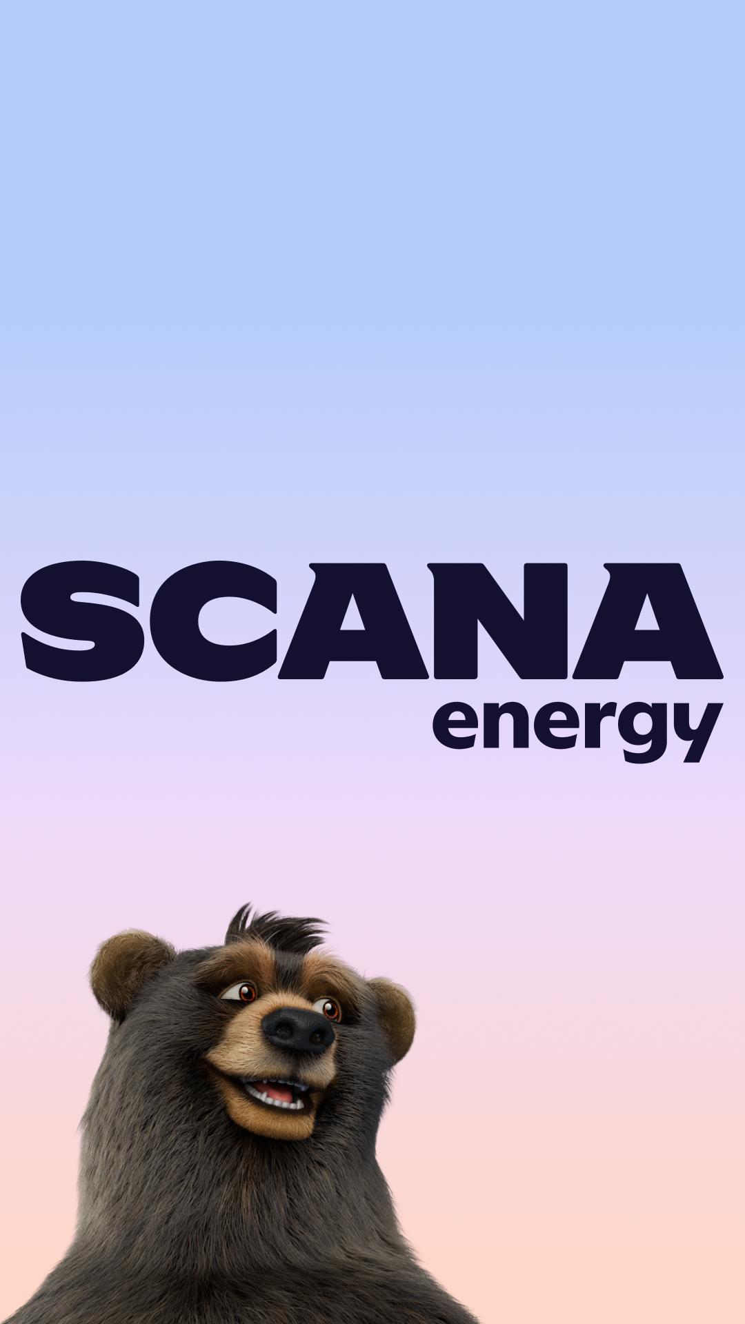
We asked the opposite question. SCANA Energy’s bears were already the most recognisable and distinctive asset, with genuine affection behind them across Georgia. Our distinctive asset testing confirmed it, but the truth showed up before the data did: customers didn’t just recognise Linda, Harry and the cubs. They knew them.
And they represented far more than familiarity. Few symbols understand home better than a bear. Long before insulation became an industry, bears were choosing dens for thermal performance, conserving warmth and surviving entire winters on stored energy. Nature had already solved the problem SCANA Energy exists to solve.
The strategy had been looking for an expert in keeping a home warm. SCANA Energy already had a family of them. Rather than retiring the bears, we elevated them. Big Bear Energy became the creative expression of the entire brand strategy – celebrating Linda, Harry and the cubs not simply as characters, but as symbols of warmth, protection and home.
So we didn’t grow out of the bears. We moved in with them.
THERE'S A BEAR IN THERE
The bears became warmer, more expressive and more at home. Their instinct for creating warmth became the organising principle behind the entire brand experience. Home wasn't simply the setting anymore. It became the system.
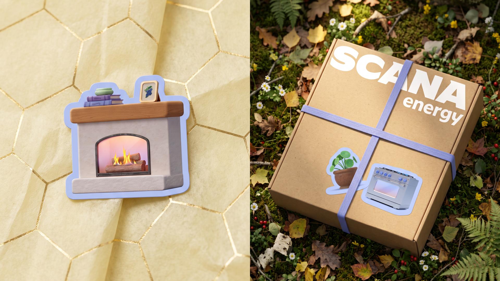
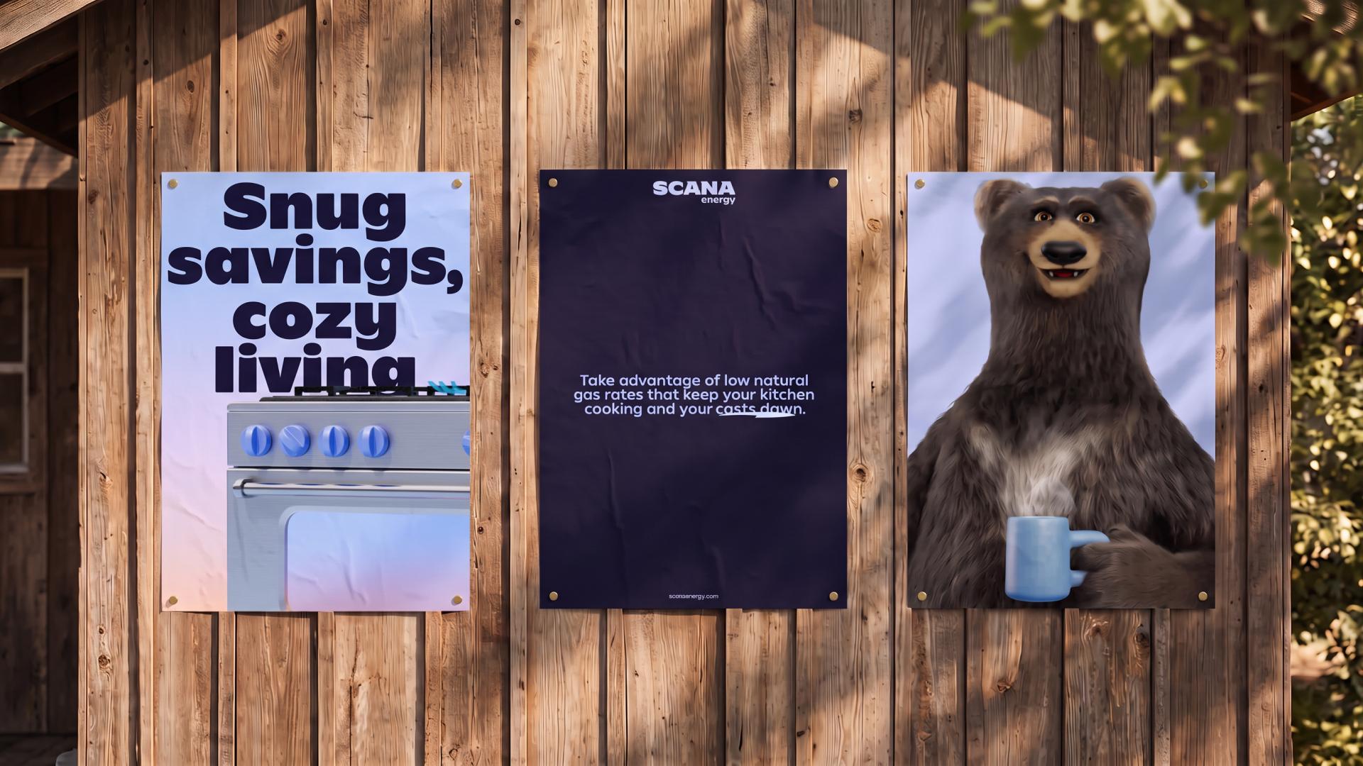
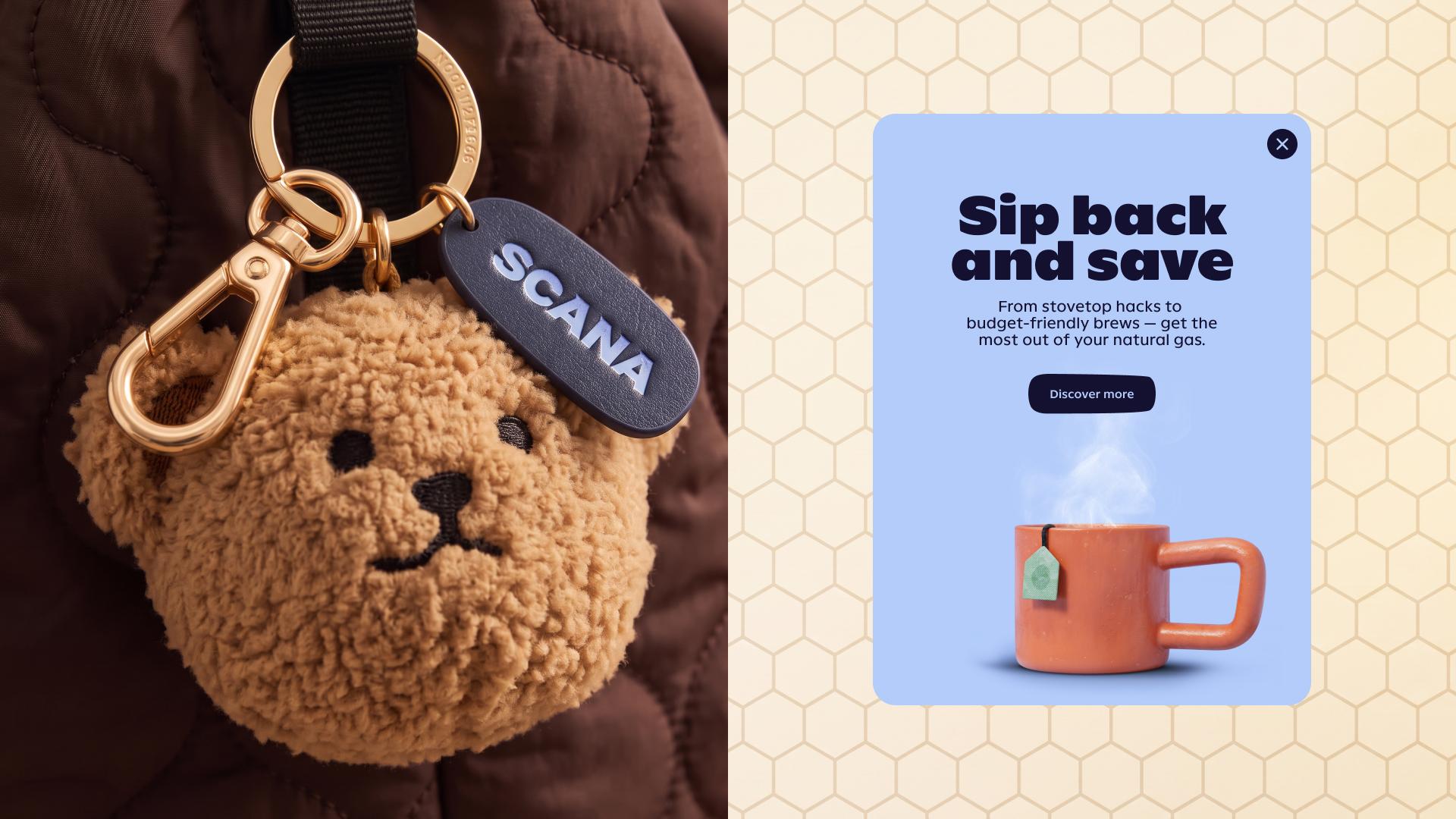
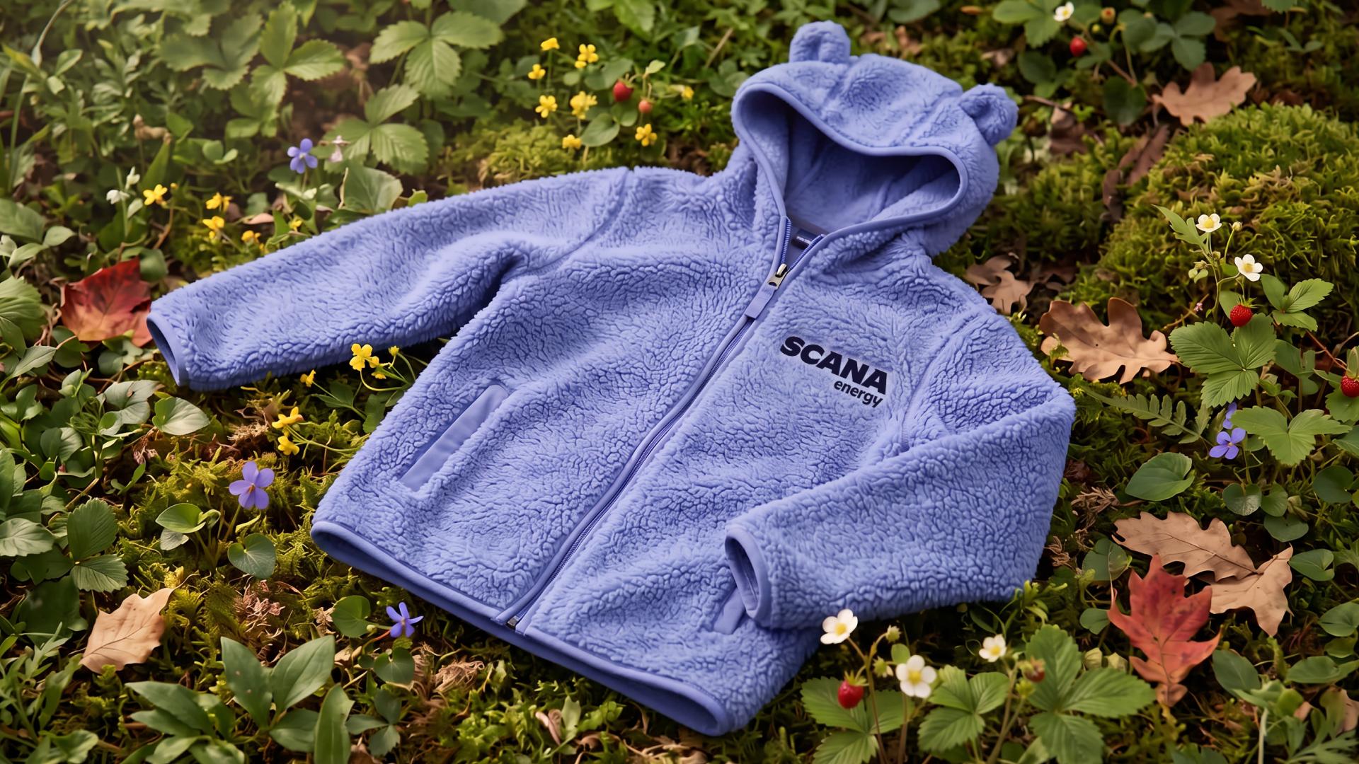
Then we let the bears leave their mark on everything. Not just the illustrations, but the way SCANA Energy looks, sounds and shows up. Their pawprints run through the entire visual identity, from cosy interiors and local character to a custom wordmark and bespoke type family created with our in-house font foundry. Rounded forms nod to ears, paws and softened silhouettes without ever slipping into caricature, giving SCANA Energy a softer kind of confidence and a foundation nobody else in the category can borrow.
The refreshed colour palette evolves SCANA Energy's familiar blues with flame-inspired tones that feel warm, calm and inviting. And the verbal identity carries the same spirit into every interaction: clear, kind and quietly playful, helping transform a confusing category into one customers can navigate with confidence.
Every element works a little harder because every element carries the same instinct. Big Bear Energy. Built into the brand system.
BUILT TO STICK
The identity rolled out across every major touchpoint – from digital platforms and billing to customer communications and internal activation – creating a more distinctive and consistent experience wherever customers meet the brand.
In a category where products are almost impossible to distinguish, SCANA Energy now has something competitors can't easily replicate. Not a different gas. A different feeling.
MAKING ITSELF AT HOME
Launched to the world on July 29th, 2026, the refreshed brand is now making itself at home. Linda, Harry and the cubs now guide every part of the brand experience, proving that sometimes the strongest brands don't need to find new symbols. They simply need to build a world around the right ones.